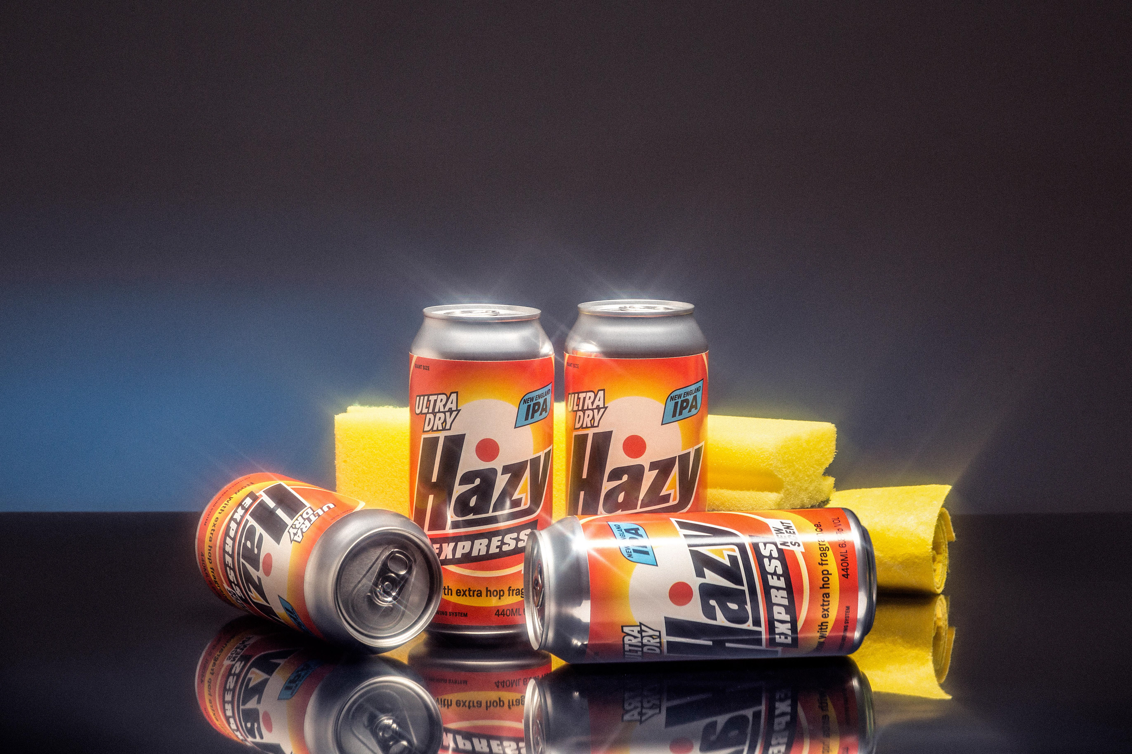
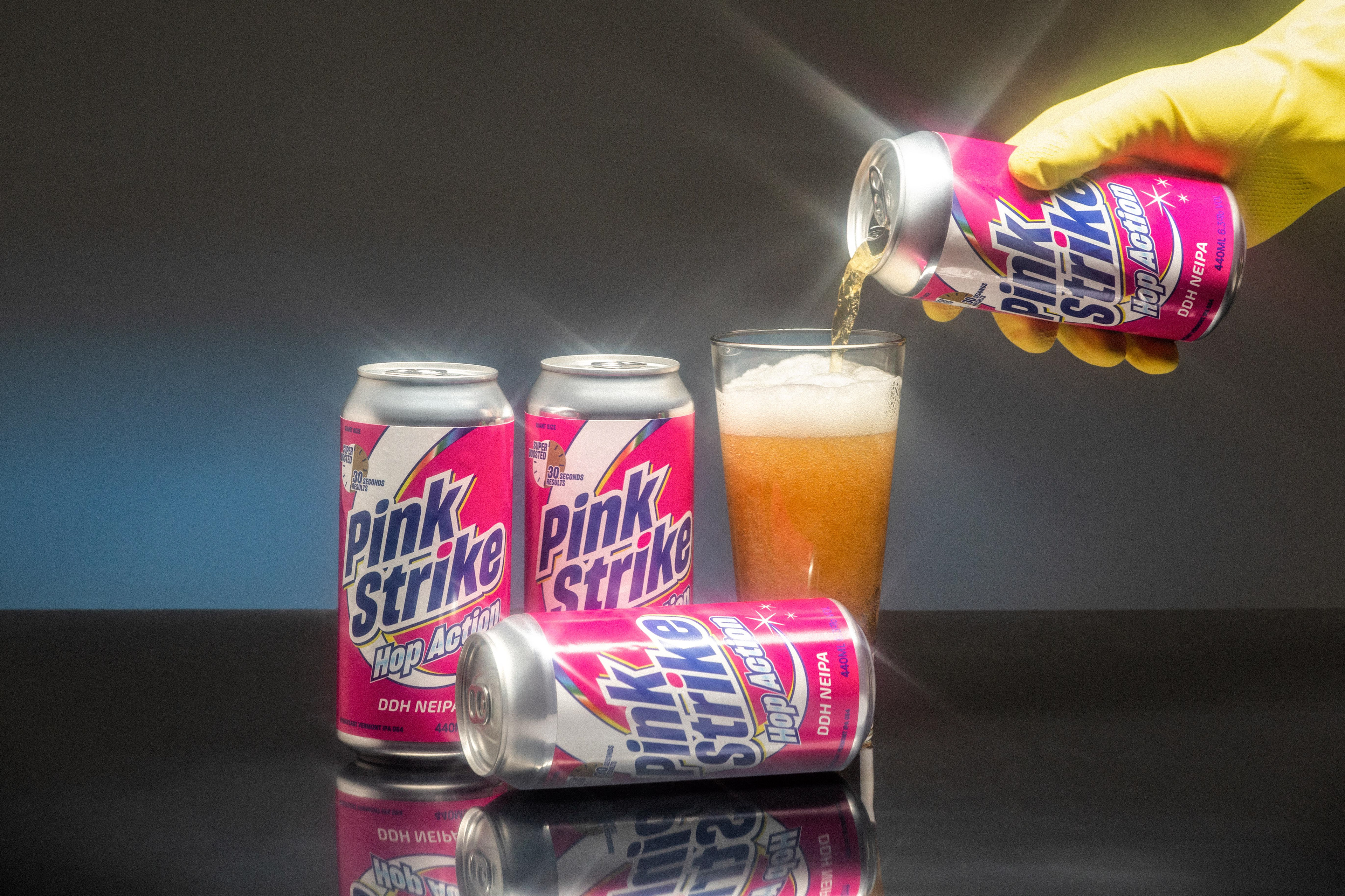
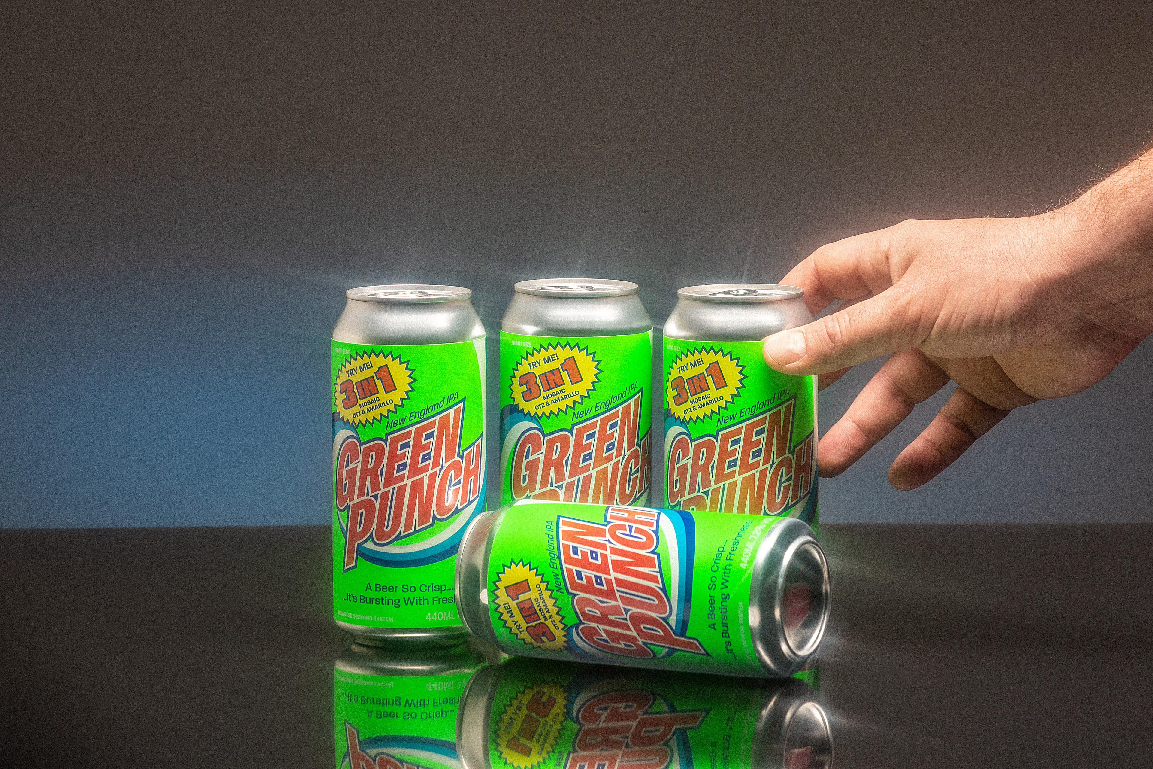
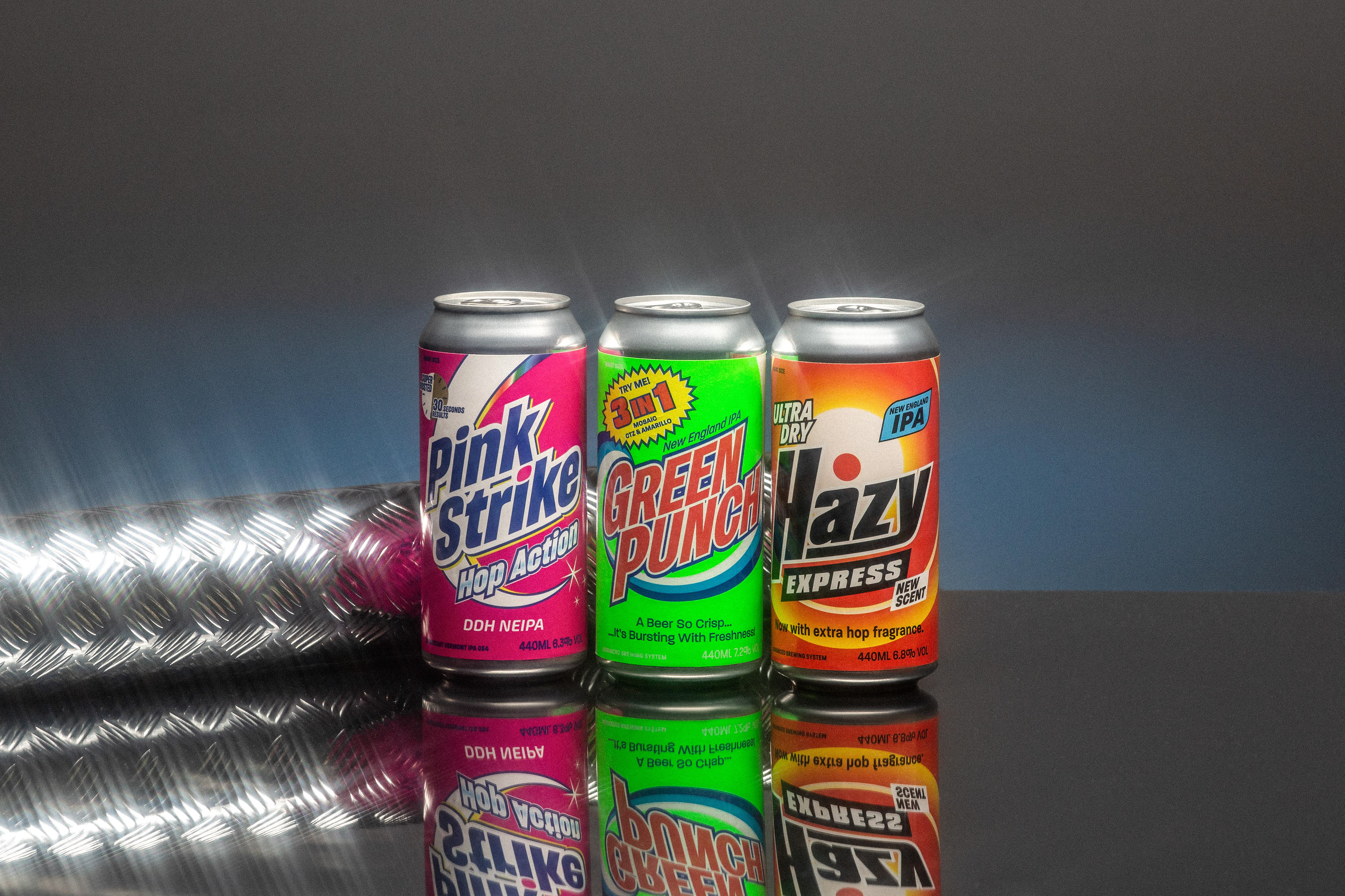
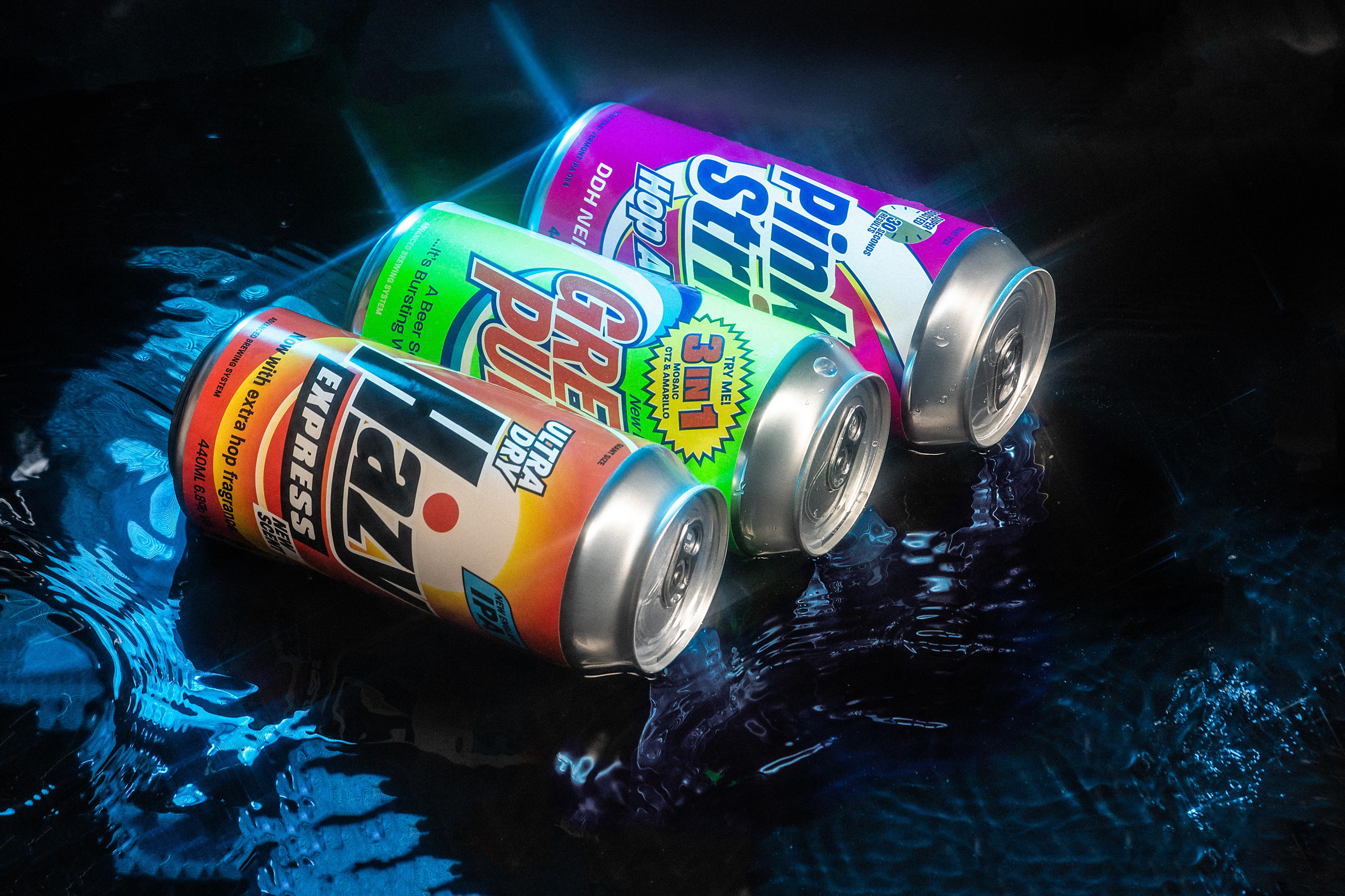
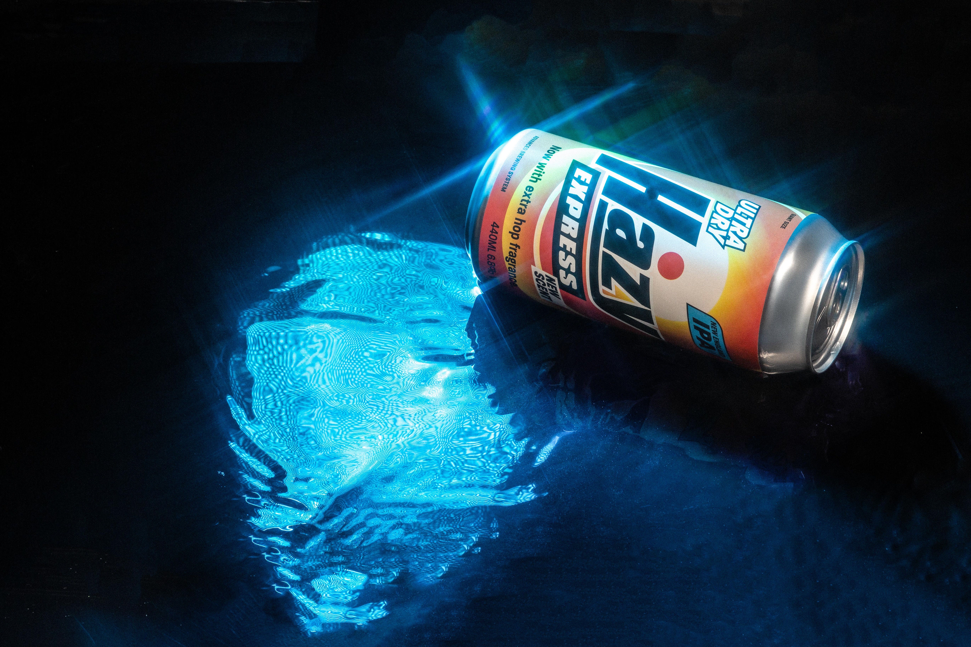
Transformation is a fundamental element in our design practice. In this case, we wanted to descontextualize a packaging icon for us, such as the classic American detergent, and take it to a product that is diametrically opposed: beer. We have chosen a product such as detergent to satirically reflect the organoleptic characteristics of these types of beer: extremely fresh and hoppy.
Photography & Lighting: IM´FRANCHO / Client: Cervezas Rio Azul / Creative Direction : Ausias Perez & Emilio Holguín / Design: Tot Palace